
Forks and Spoons
Dull winners, modern Versailles, gorgeous 45 year old designs, a sideways N on a chapel and a potential resurrection of a ministry.
The finalist for the RIBA House of The Year competition was announced, and I felt quite meh about it. It's not that it was bad, it's just that it's a bit dull. Every room was painted grey up to a fixed height and white above, and this apparently gave a 'consistent datum line' (in Kevin McCloud's words). That's something I really go for in a home, a consistent datum line. It looked antiseptic and industrial, like the kind of factory that churns out thousands of pies every day. Not that I liked many of the other entries either, there seems to be a resistance to comfort and privacy in these houses: what is the problem with curtains?
Some of the houses they showed are enormous, actual factual palaces. The world is frighteningly unequal and unstable and here they are, rich as Croesus and building a bloody great big target to live in. No wonder that the owners themselves didn't appear on several of the entries, instead Kevin was shown round by what I assumed to be the architect.
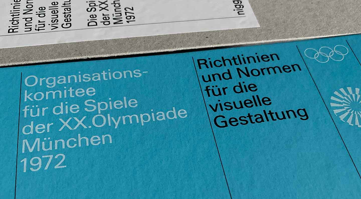
The reprinted design manual for the 1972 Munich Olympics arrived and it's gorgeous. I have opinions on emulating the style in the absence of all the limitations and restrictions that led to it, like the cost of colour printing, paper quality, registration, typesetting and all that. Stuff we rarely have to think about now, except sometimes in the opposite: work I've specified as mono has sometimes come back as 4-colour print anyway because it's cheaper.
We went for a meal in Carmarthen and though I've seen this building loads of times it's the first time I noticed the Z is a sideways N. Someone in 1850 realised they didn't have the mould for casting the Z I'd guess.

I need to work on updating the code so it works on mobile and all that but I am going to try to get Ministry of Type going again. I miss it.